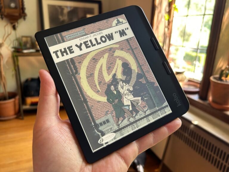
Kobo released a handful of new e-readers a few weeks ago: color versions of the excellent Libra 2 and Clara, as well as updated monochrome version of the last. But after trying them all, I can say that for most users, there is no reason to switch.
First, the color versions. I’ve been waiting on color e-paper displays for what seems like half my life, and they still haven’t achieved the level of vibrancy I’d like to actually enjoy comics and websites on them. This is still the case with Clara Color and Libra Color.
These devices use E Ink’s latest Kaleido 3 display, and things have certainly come a long way from what we saw 10 years ago. But the simple fact is that the color reproduction is still not great. Better than ever… but poor compared to almost everything else.
It’s not clear to me why you’d want color at all on a 6″ device about the size of a paperback. I’ve tried reading some comics, but the text is just too small and zooming and panning too clumsy. And the colors, while there, washed out in every shade. Perhaps a children’s book?
Now, I want to give credit where credit is due: The screen displays a lot of variety of colors — I specifically studied one panel that had several distinct but similar shades of blue (not the one below) and I was able to distinguish them on the reader almost as well as on my regular LCD. They are definitely desaturated, but they are there.
These reviews apply equally to the larger Libra color, the latest in a line of asymmetrical 7-inch devices with page-turn buttons. That extra inch offers about as much extra readability as you’d expect — a little — but the screen itself is no different.
You might be thinking: Why not just get the color so you have the choice? Besides, you can still read ordinary books. Yes, but…unfortunately, the color layer actually makes black and white content worse.
I compared the Clara Color and the BW side-by-side — and for that matter, the Clara 2E I had sitting around. While they are all nominally the same resolution, the Color looks like it has a kind of light gauze over it, slightly darkening the entire screen and reducing contrast as a result.
This is not just something minor that one observes only with a microscope. It’s really obvious. Color screens are duller and harder to read. I’ve tried and failed to capture it in photos, but trust me, it’s definitely a step down.
As such, I simply can’t recommend the color versions of these readers to anyone unless you have a specific use case where desaturated colors and a slightly degraded reading experience aren’t a big deal.
Now, as for the Clara BW, this is essentially the new default recommendation I’ll be giving — not because it significantly outperforms my favorite reader, the Clara 2E, but because it offers modest improvements for $10 less.
The new version of this very simple form factor includes a slightly updated monitor, the Carta 1300 series, which features slightly better contrast and page turning speeds. Tested against the 2E, I found it to be noticeably faster when quickly tapping pages, but not noticeable in normal use. And in terms of clarity and contrast, they were about equal to my eye, with a slight edge on the new device. My favorite feature is that it doesn’t freeze when I plug it into my computer half the times, a habit of the Clara 2E that I had given up on fixing.
So really, you’re getting what I think is the most practical e-reader on the market for most people, for only $130 instead of $140. No ads, sideloading your own fonts and documents, built-in library app, plenty of room to play and hack. However, if you have a Clara 2E, or even a Clara HD, I don’t think the upgrade is necessarily worth it. The quality of the press has not improved that much in recent years.
As before, I recommend getting the faux leather “sleep cover,” which protects your device from the usual scratches and folds into a great little stand. I recommend the Cayenne Red color so you never miss it. Trust me, you’ll be glad you spent the $30.
